


If you were to consider a medium-size agency producing, let's estimate, twenty 100 page reports each year, fifty 2-page media releases and 200 4-page minutes, with 200 words per page, that's 580,000 words already - not to mention emails, websites, internal documents, procurements, recruitment processes, forms presentations and all the draft versions produced.
Many of these words are important and necessary - however some might be better communicated graphically. Do we use visualisations as much as we could to represent choices and data?
I have rarely seen information presented in a visually exciting and impactful way in government documents or website.
Why? It can't be due to accessibility - it is simple to display the same information in text or tabular form and to provide alt text.
This is where the web can provide support.
I'm a big fan of infographics and the Information is beautiful and Cool Infographics blogs are two of my favourite sites. They provides some stunning examples of how information can be presented pictorially to convey meaning.
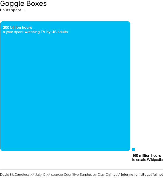
They can be as simple as this comparison of the amount of time US citizens spend each year sitting in front of the idiot box television passively watching, versus the estimated amount of time it took to create all of Wikipedia - over 1 billion english words alone (begging the question, what would happen if we could redirect all that wasted energy).

These can help agencies revitalise their data, see it in new ways and generate new realisations and understandings.
It is even possible, with open data approaches, to integrate data from other agencies with your own information and present it in visually effective ways, updating it live.
To help you get started, here's a set of online services that can be used to generate interesting visualisations. Most are free.
Online tools
Creately
Particularly useful for flow diagrams, Creately is a highly collaborative and flexible tool, allowing the creation of very professional infographics solo or in a collaborative way. The tool is also useful for project planning and other visually focused activities.
Gapminder
As used by Hans Rosling in brilliant TED talks, GapMinder provides the ability to automate time series to look at data changes over time. You can choose from existing data or add your own to create brilliant mash-ups.
Google Public Data
Google Public Data is more of a simple charting tool that you can use to display your information as bar, line and pie charts, however it also allows you to add bubbles over Google Maps and provide time series data, where you can map one or two variables and manually jump around in time, or hit a play button to watch changes unfold step by step.
Hohli Charts
A simple, yet elegant tool for creating simple charts, scatter plots, radar charts and venn diagrams based on Google's charting tools, Hohli makes it very easy to make distinctive graphs.
Many Eyes
This is a beta service provided by IBM, but don't let that scare you - the tool works fines. Many Eyes lets you upload your own data or use data in the site to generate a wide range of visualisations including a good range of world maps, word clouds bubble charts, scattergrams and treemaps. There's a good chance you'll find some of your publicly released data already visualised here.
New York Times Viz Lab
This can be used to visualise New York Times data using an embedded version of IBM's ManyEyes technology. You can also look through visualisations created by others. While not a separate service, it should make you consider whether you could integrate a visualisation tool into your own website to allow your own visitors to visualise your data and create their own views.
Statplanet
Visualise the planet using existing data, or create your own charts, scatter plots and world maps by adding your own. StatPlanet's flash-based mapping tool is used by a number of public sector organisations at a global scale to plot development data across the world.
TagCrowd
A functional word mapping tool, TagCrowd isn't as versatile as Wordle (below), however is very good for some uses, such as creating an even block of text, mapping frequency by size - such as for the backdrop of a document cover.
Wordle
If you need word maps, Wordle creates the most elegant and flexible ones on the web. Use it to look at your documents or speeches in a visual form (you might be surprised at which words occur most frequently) and tweak settings such as font, direction and colours. It can also be useful for mapping open answers in survey data to visually represent the top concerns.
Other tools
Here's some web-based visualisation tools that use existing online data to present it in visual ways. They provide inspiration and new approaches for viewing internet information, 16 Awesome Data Visualization Tools and The Best Tools for Vizualisation.
And here's 28 tools you can use to add visualisations to your own website.
Know of any other great visualisation tools? Add then in the comments below.

Craig,
ReplyDeleteThanks for the post. I think that allowing people to visualise government data is a very powerful form of communication. My company Space-Time Research works with quite a few government depts/NGOs on helping them to present appropriate and informative visualisations of their data. Good visualisation can really help provide a better context for people to understand and relate to data. When you add some interactivity to that, 100s or thousands of potential views of the data can be wrapped up in a single Web page.
For anyone interested in the kind of visualisations we do, you can check out my favourite one at Cancer Council Victoria (just so interesting to sift through that data) at http://vcrdata.cancervic.org.au:8082/ccv/, or go to the gallery on our website (http://www.spacetimeresearch.com/data-visualization-gallery.html).
Cheers,
Don McIntosh
Not a tool, but an hour long video report on Journalism in the Age of Data:
ReplyDelete"Journalists are coping with the rising information flood by borrowing data visualization techniques from computer scientists, researchers and artists. Some newsrooms are already beginning to retool their staffs and systems to prepare for a future in which data becomes a medium. But how do we communicate with data, how can traditional narratives be fused with sophisticated, interactive information displays?"
http://datajournalism.stanford.edu/
My take away from this - there are lots of fancy tools, but there is still an art to communicating.
Great post! Sometimes I think we are led to believe government has to be boring to be believable and trusted. Sometimes I think we are encouraged to be boring so we don't draw attention to ourselves.
ReplyDeleteBut I think the best thing government can do is educate the public about government. And we need to start believing that bad things won't happen if we do. But to achieve this we need to change our style of communication or the public won't even pay attention - they barely do now unless there is controversy.
Thanks for sharing some of the resources available for dressing up our style!
Now all we need is a government which gives us access to data.
ReplyDelete